The FreeBSD Diary |
| (TM) | Providing practical examples since 1998If you buy from Amazon USA, please support us by using this link. |
|
FreeBSD Virtual Memory
24 April 2000
|
| Felix Matathias contacted me via IRC to mention this research of his. I've been given permission to reproduce the article here. Hope you find it interesting. |
|
Virtual Memory Project on 3.4FreeBSD
|
Felix Matathias |
|
ABSTRACT
|
In this project we measure cpu utilization, page fault numbers, page fault service time and resident set size of a test process on 3.4FreeBSD. For this experiment we used a Pentium III box at 450 Mhz with 64Mb of memory. The test process was the only process running at the time of testing. In this version of the experiment we were not running under X11, so that X11 will not compete with our test process for memory, swap space or cpu time. |
|
METHOD
|
The test process that we profiled allocates 48Mb of RAM as a char matrix. First of all we write the entire matrix with a random value so that all of the memory will be dirty for subsequent access. Then we randomly access the matrix with various degrees of locality. The locality parameter, x, takes values from 0 to 100 and we performed the experiment with 5 different values, namely 0(worst locality), 25, 50, 75 and 100(best locality). We measured the performance of the Virtual Memory system of 3.4FreeBSD by directly adding code to the kernel. We created a new system call, vm_statistics( struct *data, int pid), that returns all the profiling data for the process with the specific pid. We run the test process as the parent and then the child measures the performance of the parent by repeatedly calling the above system call every second. We write the data to a file and then process it with Microsoft Excel. We let the test process run for 500 seconds. |
|
RESULTS
|
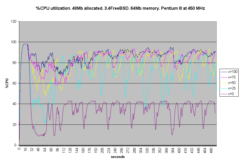
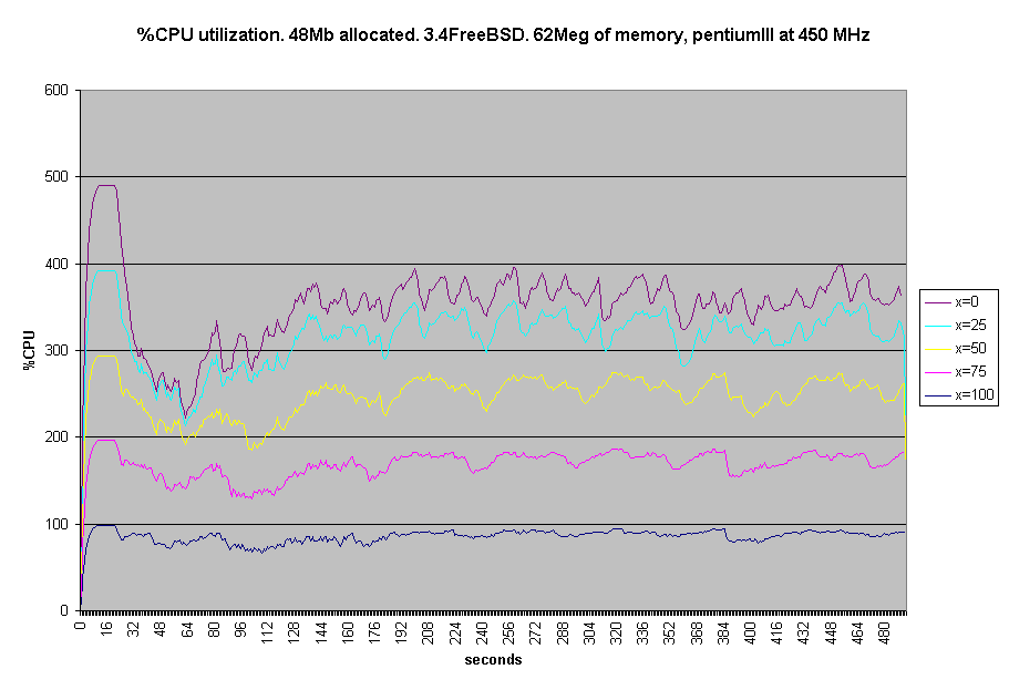
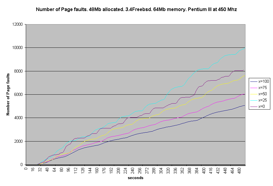
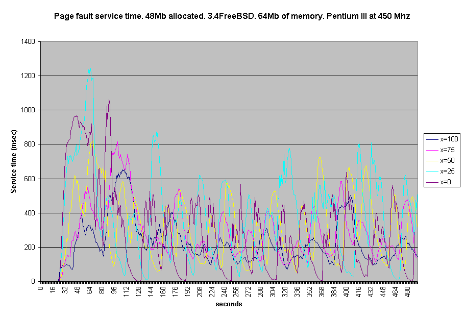
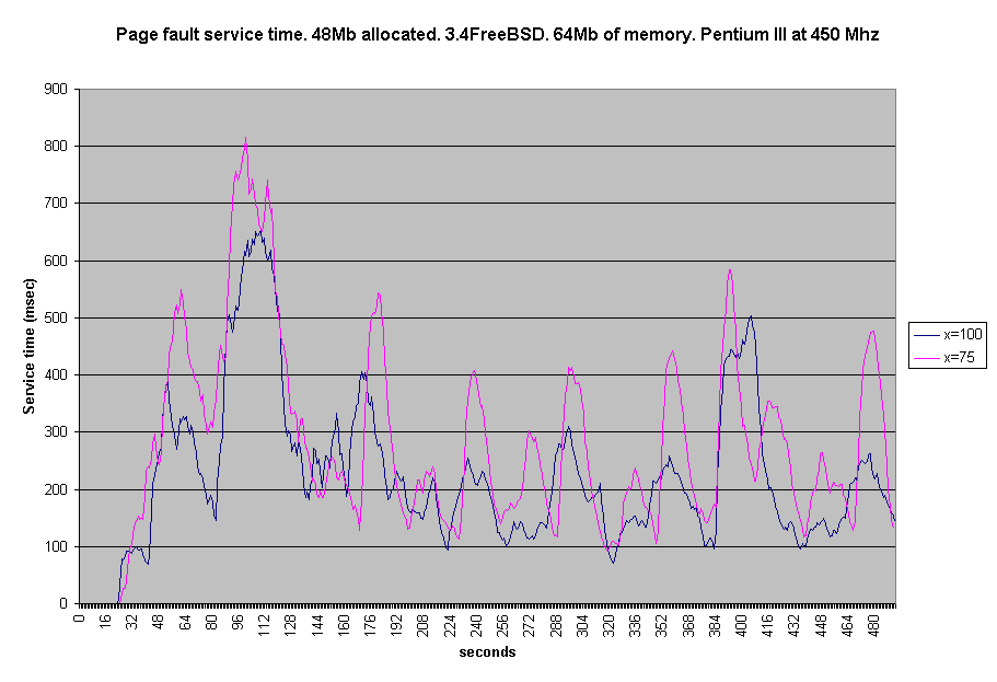
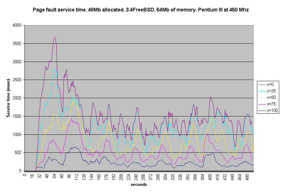
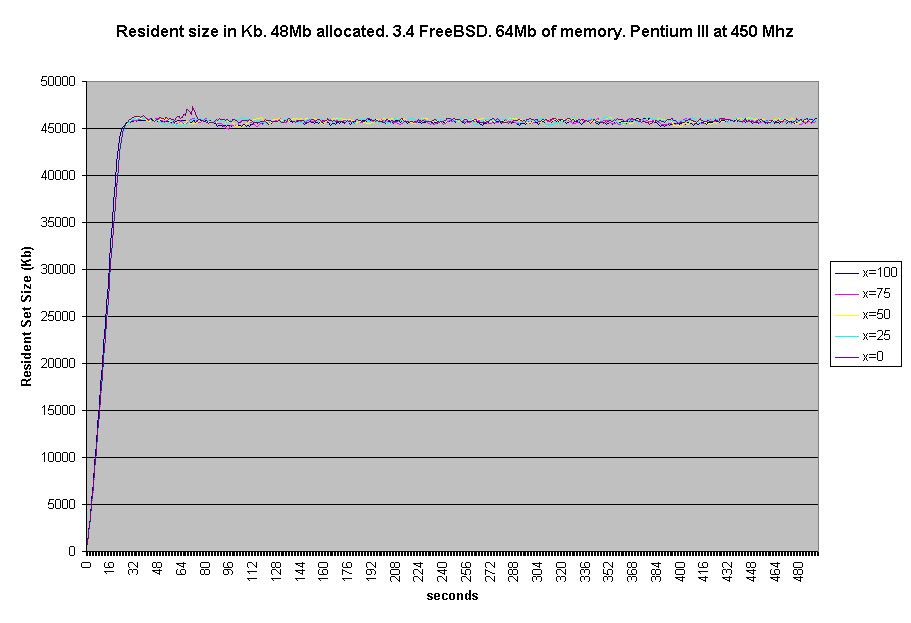
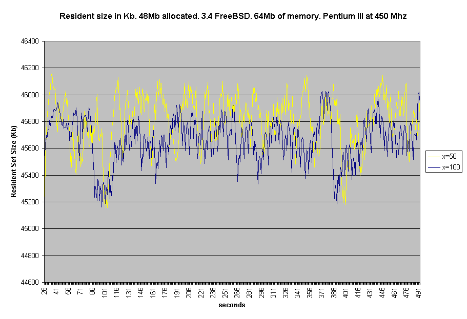
In the first graph below we plot %CPU utilization versus time for 5 different values of the locality parameter x. It is evident that a certain periodicity in the utilization of the cpu exists. We noticed this periodicity in all the profilling quantities that we measured. We did not attempt to fit the data yet, but it seems that a squared sine or cosine will probably fit the data well. Graph: CPU utilization vs time It is also evident the strong correlation between the locality parameter x and the %cpu utilization. In the following graph we plot again %CPU utilization versus time, but this time we put each graph on top of each other in order to better observe the periodicity of the cpu utilization. Please disregard the Y axis and just observe the patterns. Graph: CPU utilization vs time In this graph it is even more evident the periodicity of the cpu utilization. It is also clear that if we try to fit the data with a squared sine for example we will have to modulate BOTH PERIOD AND AMPLITUDE.The amplitude seems to grow with increasing x and the same holds for the period. In the following graph we plot the absolute number of HARD page faults versus time. We noticed a strange anomaly. The run with x=0 had less number of page faults than the x=25 run. We do not know how to interpret that yet. Graph: Hard page faults vs time In the next 3 graphs we plot hard page fault service time in milisecs versus time. The first plot includes all 5 runs, the second plot only 2 in order to show more clearly the periodicity and the third one superimposes all 5 runs on top of each other. Graph: Hard page fault #1 The two final graphs plot resident set size of the test process versus time. The first graph demonstrates the gradual occupation of memory while the second graph shows the evolution of the resident set size after the size has saturated at about 45 Mb. |
|
CONCLUSIONS
|
The above presentation shows clearly the correlation between locality and cpu utilization, service time and number of page faults. We also discovered that 3.4FreeBSD demonstrates a certain periodicity during the run of the test process. We have not fit the data yet but it seems that a frequency-and-amplitude modulated sine squared will fit the data satisfactory. |
|
ACKNOWLEDGEMENTS
|
I wish to thank my partner Slawek Zakrzewski for his invaluable help and also Dr. Gene Stark for his motivation for this project. For questions please contact Felix Matathias. |